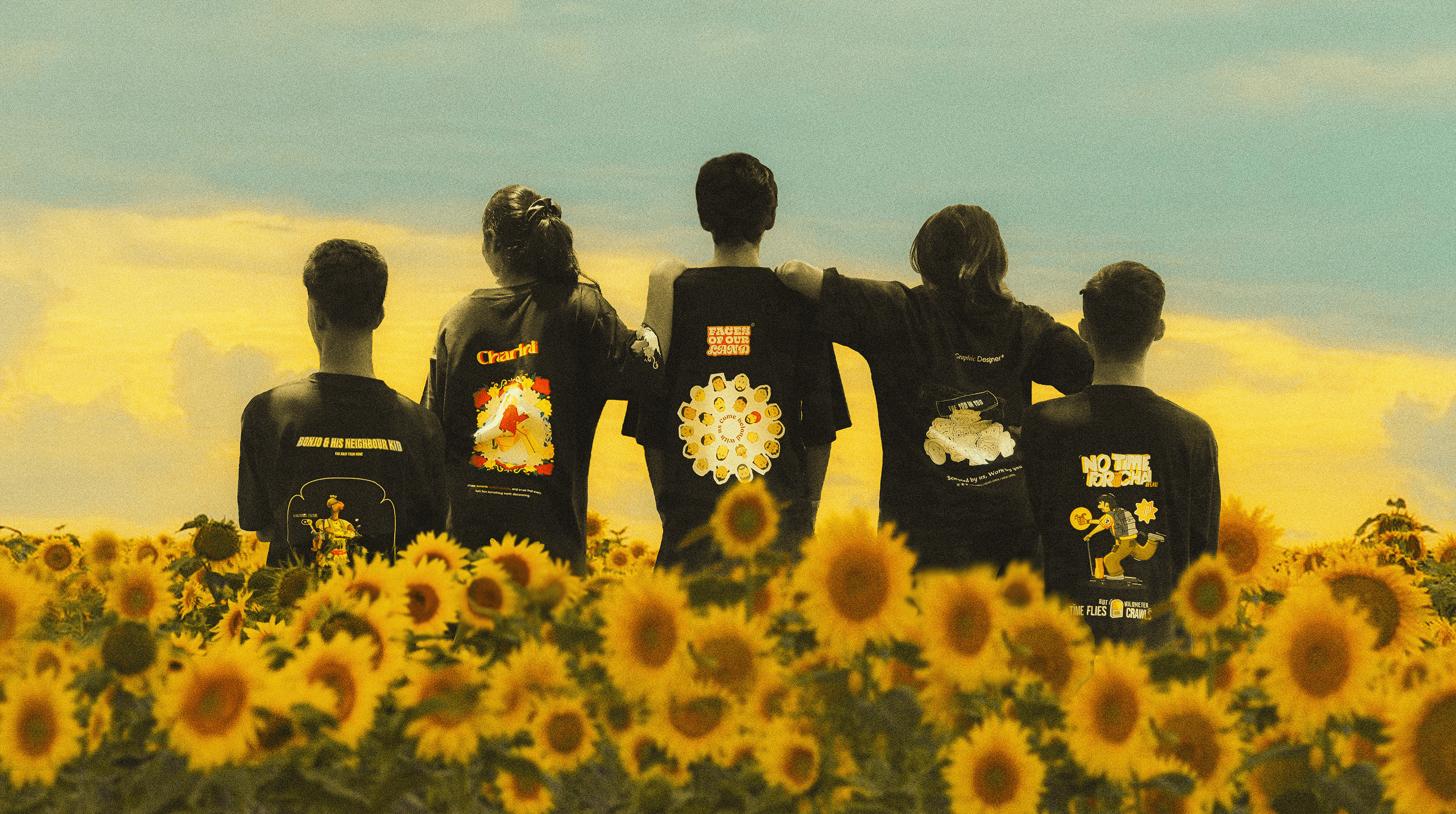


Industry
B2C, e-commerce, clothing & streetwear
Type
In-house
Duration
8 weeks (6-week brief, +2 for supplier sourcing and production testing), 2025
Role
UX researcher, visual designer, illustrator


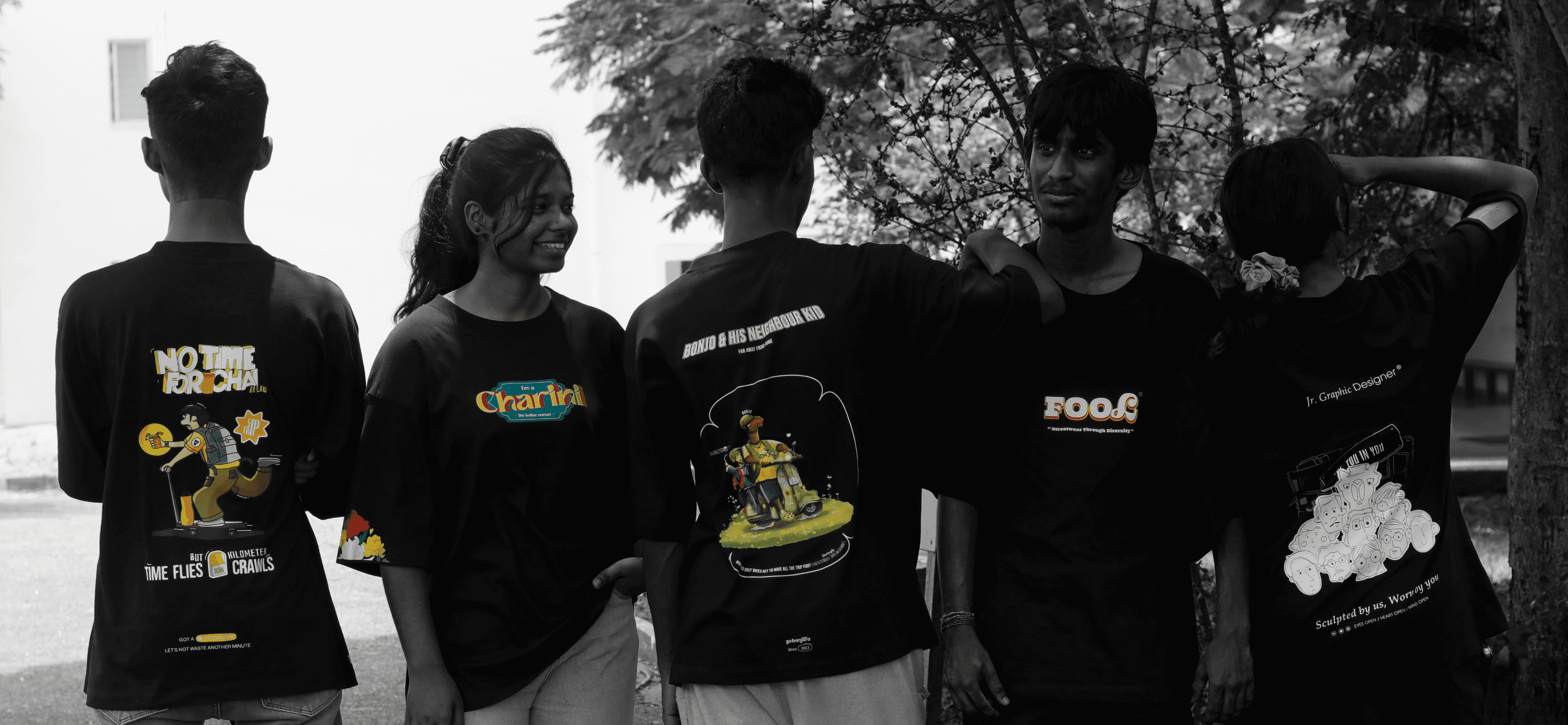
PROBLEM STATEMENT
↑ KEY INSIGHTS FROM THE RESEARCH & USER INTERVIEWS

TENSION
Users wanted rich, illustrated graphics. The price ceiling was ₹600 (€6), on small-batch production. No printing method delivers all three.
Rich illustration means multiple colors. In screen printing, every color has its own screen, setup cost, and step in the run; the economics only work at volume, and the founder wouldn't commit to volume until it was proven. So the want and the budget pointed in opposite directions. Multi-color is a volume game, and we weren't playing it.
RESULT
SOLUTION
I compared three print methods against the ceiling. DTF (direct-to-film) won on the one variable that mattered: it prints full-color artwork onto film and heat-presses it onto the garment, so the per-unit cost is the same whether the design uses three colors or three hundred. No minimum order. That suited a five-design drop at exactly 100 units each.
DTF sits on the fabric rather than soaking into it, so the hand feel is less soft than screen print, and durability depends on film quality and press settings. I tested it to roughly 40 washes before visible degradation. Buyers at this price told us they expect 10–20 wears before replacing a tee. 40 washes clears the bar the garment actually has to meet, so I stopped optimizing past it.

COST & PRODUCTION CHALLENGE
There were multiple factors to consider before even ideating the concept.
Oversized fit
DTF print
Hangtag & packaging
Per Tag (₹5 / €0.05)
Product Cost
₹385 / €3.85
Volume negotiation
Negotiated product cost
₹380 / €3.80
Delivery & logistics
GST (Indian tax, Paid by the customer, apparel under ₹1,000)
5% (₹23 / €0.23)
Landed Cost
₹483 / €4.83
Retail ceiling
₹600 / €6.00
Margin per unit
19.5%% (₹117 / €1.17)

COST - RESOLVED (COGS)
I met suppliers and printers in person instead of working off emailed quotes, and negotiated on volume. The blank moves about ₹50 either way depending on supplier and stock, which swings the margin between roughly ₹65 and ₹170 per unit: 11% to 28%. I planned against the low end.
DTF is priced by print area. So before I drew anything, I locked the area: A3 on the back, A5 on the chest. That one decision turned production into a design brief. I knew the exact canvas before the first sketch: dimensions, aspect ratio, and how much of the garment the artwork would cover. As the researcher, I set the constraint; as the illustrator, I had to make it work.
So I composed every illustration to fill the A3 frame edge to edge. Nothing scaled down later, nothing cropped to fit, no cost surprises at the printer. Working inside a fixed frame from the first sketch made the compositions tighter than they would have been otherwise. The A5 chest print stayed in the spec as a small mark only. Priced by area, it added ₹20 rather than doubling the cost, and it gives the tee a front at all when it's worn open or layered.
Now I could draw.
SKETCHES & IDEATION


TEE 01
GO BANJARA
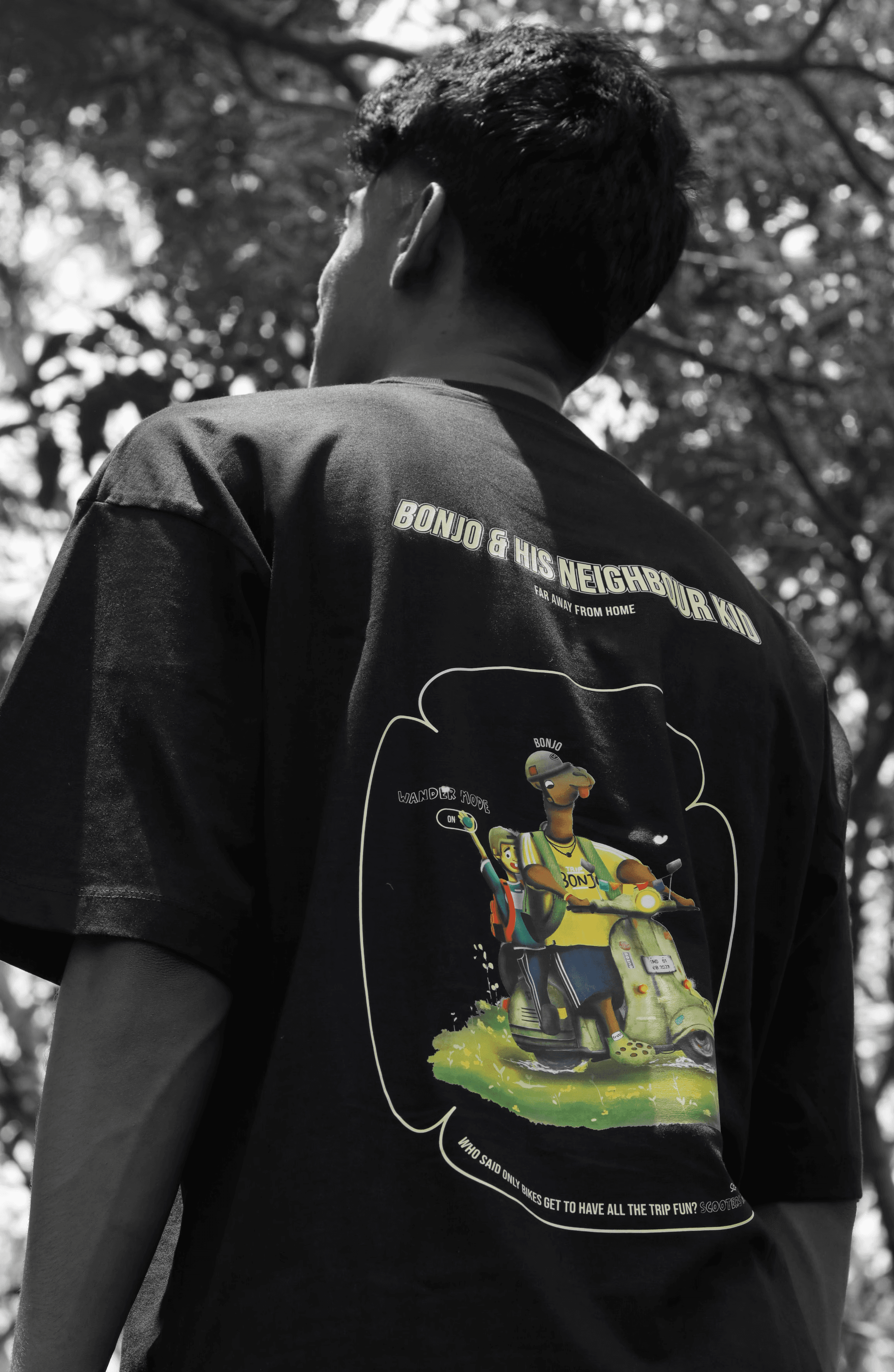
BONJO & HIS NEIGHBOUR KID
Bonjo is the brand's mascot, so he'd earned a place on a tee, but a logo drop wouldn't have done him justice. First impressions for a new brand need to stick, not just show up. So instead of featuring Bonjo, I gave him a scene: him and the kid next door, mid-something.
The graphic stopped being a mascot and started being a character. Something to discover rather than a shirt that gets a smile, then a question, and leaves you remembering the name.
KIMBERLY
HEX
RGB
CMYK
D9E7A8
217 / 231 / 168
6 / 0 / 27 / 9
ATOMIC BLACK
HEX
RGB
CMYK
0F0F0F
15 / 15 / 15
0 / 0 / 0 / 94
IMITATION GOLD
HEX
RGB
CMYK
EBCB4D
235 / 203 / 77
0 / 14 / 67 / 8
YELLOW GREEN
HEX
RGB
CMYK
E8E52A
232 / 229 / 42
0 / 1 / 82 / 9



TEE 02
GO BANJARA
NO TIME FOR CHAI
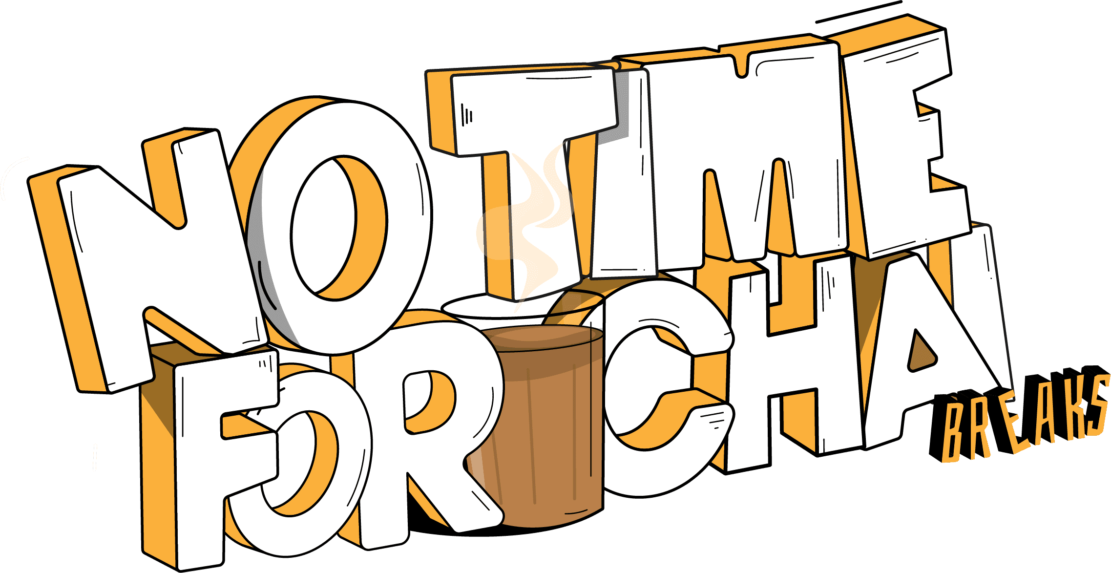
In India, chai isn't a drink; it's a pause. A ritual that carries conversations, friendships, and silences, from roadside stalls to home kitchens. Mr. Traveler rides his scooter with a Western silhouette and an Indian soul, and chai is always somewhere on his mind. But today he rides past the stall. Not because he wants it less, but because the road ahead is longer than the stop is worth; no time for chai. There's a whole world out there.
HAPPY ORANGE
HEX
RGB
CMYK
F1B353
241 / 179 / 83
0 / 26 / 66 / 5
MILK TEE
HEX
RGB
CMYK
B28454
178 / 132 / 84
0 / 26 / 53 / 30
FULL WHITE
HEX
RGB
CMYK
FFFFFF
255 / 255 / 255
0 / 0 / 0 / 0
BLACK HOLE
HEX
RGB
CMYK
000000
0 / 0 / 0
0 / 0 / 0 / 100

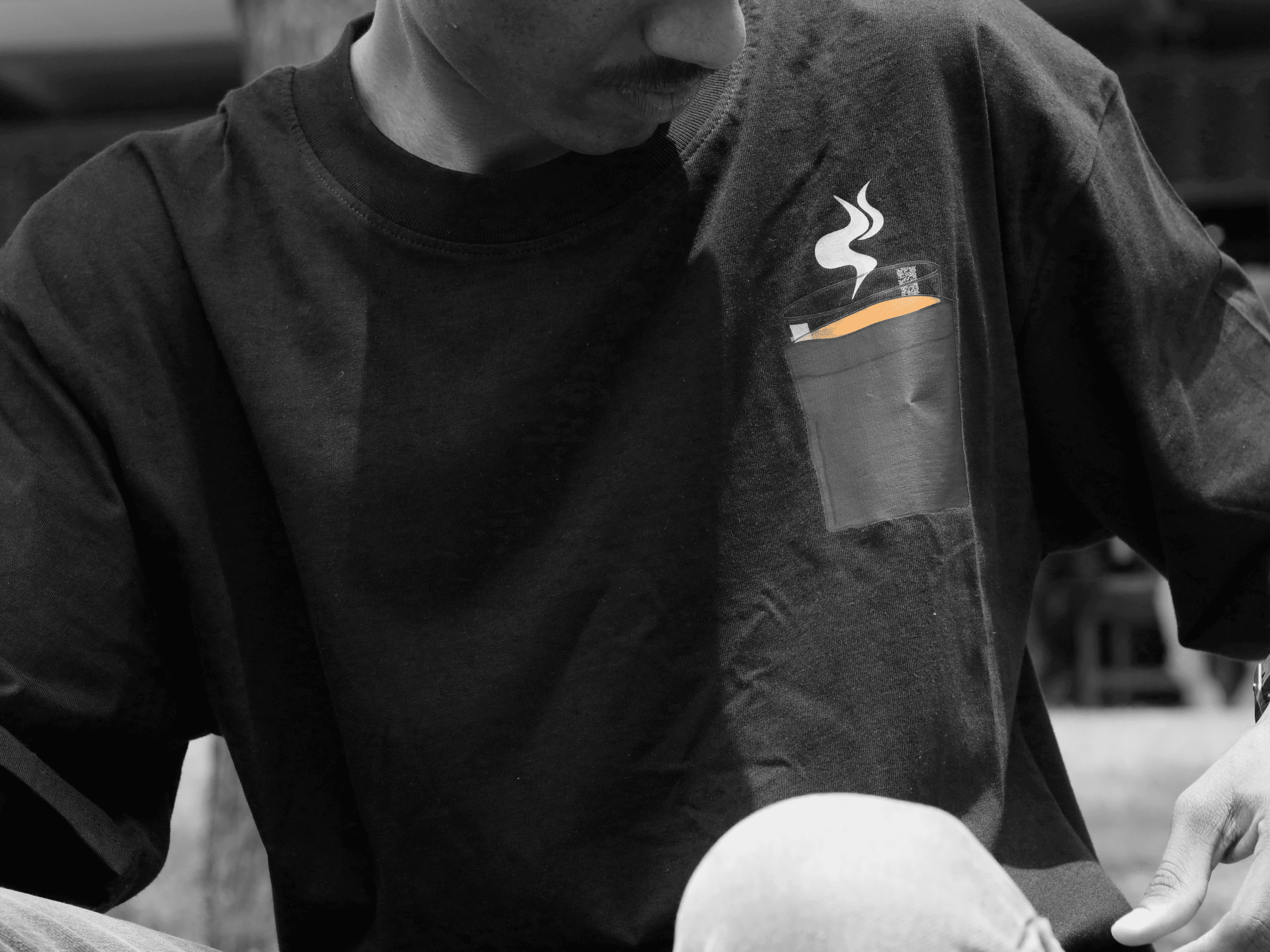
TEE FRONTSIDE ARTWORK
STORY BEHIND THE TEE
Meet Mr. Traveler riding his scooter, a subtle Western twist blending into an Indian soul. No matter where he goes, chai is always on his mind, a reminder of home and comfort. But today feels different. As he rides through open roads and endless horizons, a thought lingers: the world is too vast to pause every time.
“Time flies fast,” he thinks, “but the distance always feels slow.” For once, he smiles and skips the next chai stop. Not because he loves it any less but because there’s so much more waiting to be seen.“No time for chai… there’s a whole world to explore.”

FACES OF OUR LAND
TEE 04
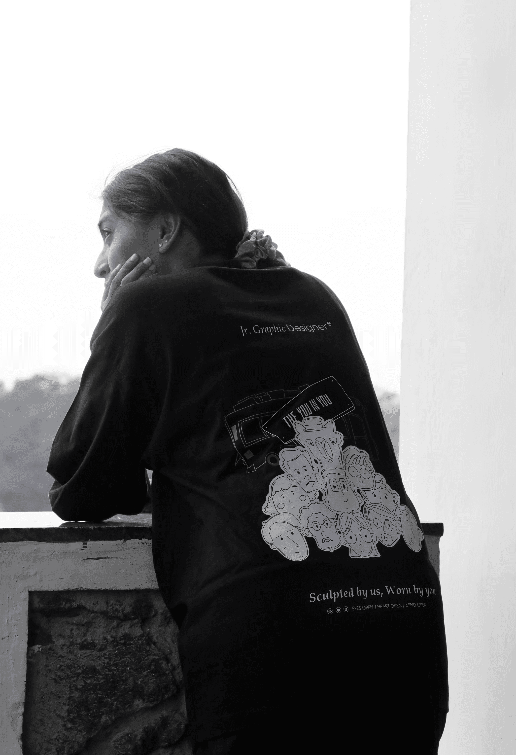
Faces of Our Land: The Fool” is a tribute to the many faces that make up India. Each portrait on the T-shirt reflects the diverse people, cultures, and traditions that shape the nation’s identity. From the vibrant streets of bustling cities to the quiet corners of remote villages, every face carries a story, a history, and an essence of India. Like a traveler collecting memories, this design invites you to witness and celebrate the land's spirit through the people who define it.


TEE 03
GO BANJARA
CHARINI
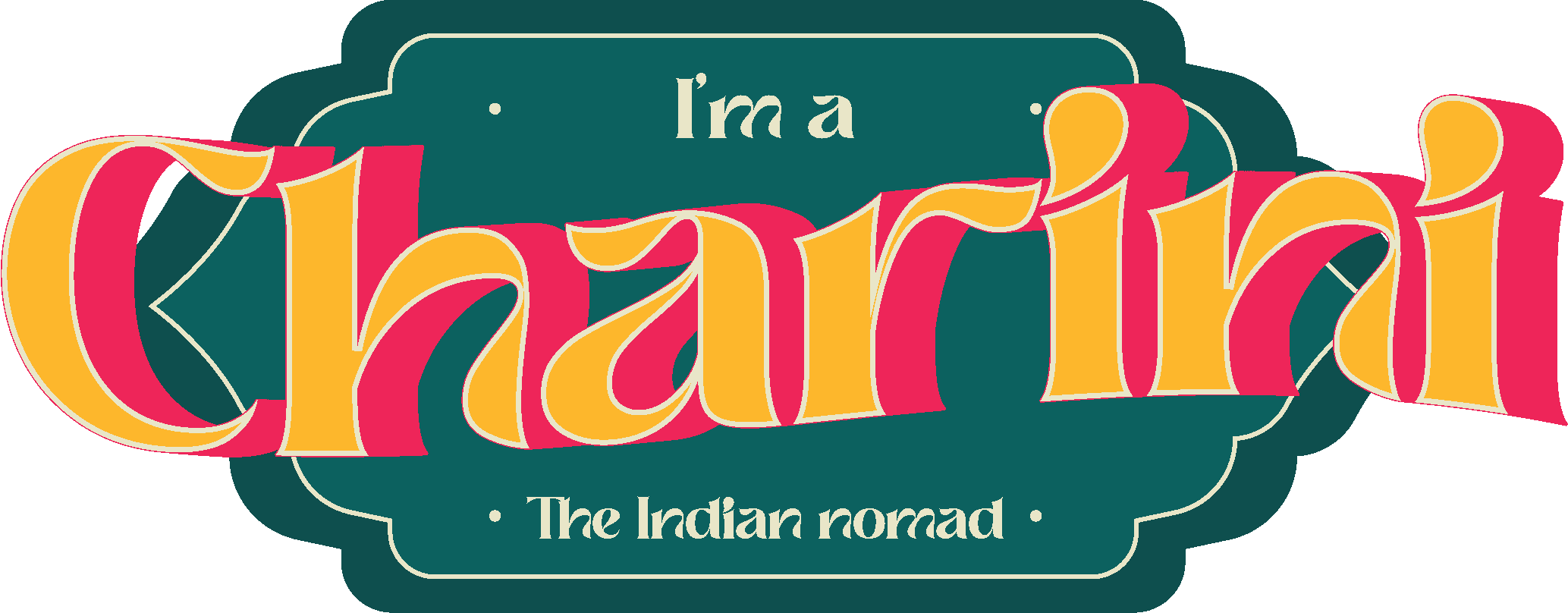
Travel gets framed as a male space. Adventure has no gender, and I wanted a tee that said so without saying it. Charini is Sanskrit for a woman who wanders, a seeker of paths. The florals around her stand for growth and for what the journey gives back: every bloom is a place she's been. This tee is for the women who go anyway.
EGG YOLK
HEX
RGB
CMYK
FCB62C
252 / 182 / 44
0 / 28 / 83 / 1
NOBLE TEAL
HEX
RGB
CMYK
0E6160
14 / 97 / 96
86 / 0 / 1 / 62
CREAMY BUTTER
HEX
RGB
CMYK
F3EAC6
243 / 234 / 198
0 / 4 / 19 / 5
VALENTINE
HEX
RGB
CMYK
EC2859
236 / 40 / 89
0 / 83 / 62 / 7


SLEEVE HEM DESIGN

STORY BEHIND THE TEE
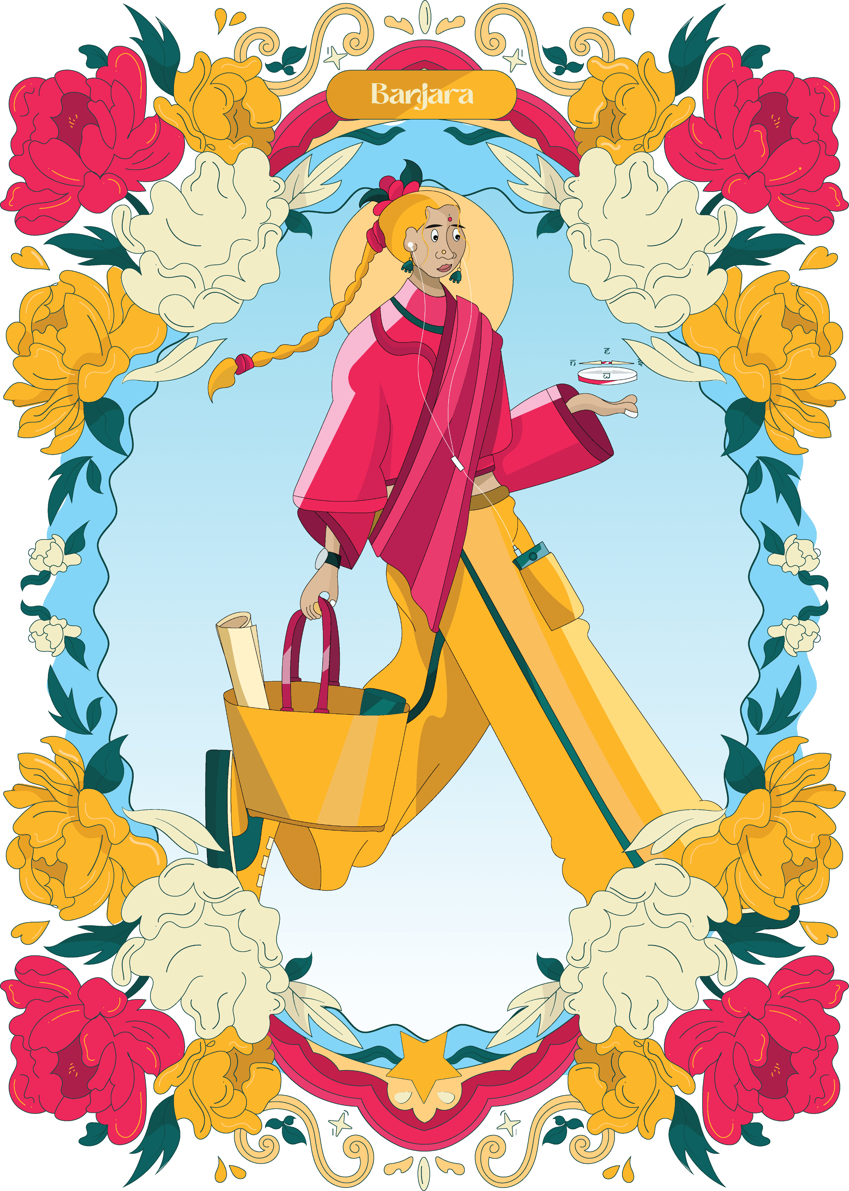
" Charini " is a Sanskrit word for a female traveler, a seeker of new paths. This tee is for the women who explore, embrace adventure, and roam free. The floral patterns around her symbolize growth, freedom, and the journey's beauty. Every bloom tells a story of discovery, resilience, and wanderlust. More than a tee, Charini celebrates fearless exploration.

FACES OF OUR LAND
TEE 04
Faces of Our Land: The Fool” is a tribute to the many faces that make up India. Each portrait on the T-shirt reflects the diverse people, cultures, and traditions that shape the nation’s identity. From the vibrant streets of bustling cities to the quiet corners of remote villages, every face carries a story, a history, and an essence of India. Like a traveler collecting memories, this design invites you to witness and celebrate the land's spirit through the people who define it.
VERMILION RED
HEX
RGB
CMYK
EB5327
235 / 83 / 39
0 / 65 / 83 / 8
APRICOT ORANGE
HEX
RGB
CMYK
EE964E
238 / 150 / 78
0 / 37 / 67 / 7
WARM CREAM
HEX
RGB
CMYK
FFF1E9
255 / 241 / 233
0 / 5 / 9 / 0
SOFT GREY
HEX
RGB
CMYK
F3F3F5
243 / 243 / 245
1 / 1 / 0 / 4


(FRONT SIDE
CHEST DESIGN)

TEE 05
GO BANJARA

WORKWEAR TEE
Not part of the retail drop. A team tee for Go Banjara itself, built on the same blank and the same print spec, so it shares the drop's economics, streetwear ease, and minimal mark- something you'd wear on a day off and not feel like you're in a uniform.
BUTTERY WHITE
HEX
RGB
CMYK
FFFBE8
255 / 251 / 232
0 / 2 / 9 / 0
FULL WHITE
HEX
RGB
CMYK
FFFFFF
255 / 255 / 255
0 / 0 / 0 / 0
ANCHOR GREY
HEX
RGB
CMYK
58585D
88 / 88 / 93
5 / 5 / 0 / 64
BUSINESS BLACK
HEX
RGB
CMYK
141316
20 / 19 / 22
9 / 14 / 0 / 91


OUTCOME
The brief was to take Banjara from no product direction to a manufacturable product. That's where my scope ended, and it ended on schedule. Five designs, drawn to a print area I'd costed before sketching. ₹380 unit cost against the ₹600 ceiling, holding ₹117 a unit after delivery and ~19% tax, with an 11% floor if blank pricing moves against us.
I delivered the final illustrations, artwork dimensions at the locked A3 and A5 print areas, hangtag specifications, and print-ready production files- everything the brand needs to place an order without coming back to me.
Not launched yet. Production timing and launch sit with the brand, which is how this was scoped from the first conversation: prove the range can be made at a price that works, then hand the decision back. A founder who wouldn't fund volume before demand was proven was never going to green-light a launch in eight weeks, and designing as though he would was the mistake.
Whatever Banjara launches, it launches affordably.
FOUNDER'S VIEW
We finally felt like the brand has found its voice. After a long development process, we’re ready to take it to market. What stood out was Kabilan’s ownership from research and graphics to personally working with vendors and printers to bring it to life.
The goal was simple: make affordable, oversized tees with graphics that feel distinctly Indian. He even went beyond the brief, handling the product photoshoot himself. Excited to see where this goes next.