
Industry
Human Identity, Speculative Design
Type
Self-Initiated
Duration
1 Week, 2026
Role
Visual Designer, UI Designer
Human Status™ is a speculative design project that explores a future where personal identity is represented through standardized visual icons rather than conversations or social interactions.
In this imagined system, a central organization called Human Status collects personal data, translates it into simplified visual symbols, and assigns each individual a public identity that others can instantly interpret.

PROVOCATION
Are we witnessing the slow decline of our ability to express ourselves? We used to introduce ourselves through a conversation, a story, a shared moment. Now we introduce ourselves through a resume, a profile, a rating, a curated feed. Somewhere along the way, a collection of visuals, metrics, and data points started speaking for me, not my own words. And I don't know where it's leading.
PROBLEM
An Identity is no longer something I describe. I know I create the data, but I don't control what the system decides it means about me. A rating here, a score there, a personality assessment, a skill endorsement. Every platform I touch turns me into a data structure. This isn't a future risk; it's already happening. The real question is how far it goes next.

FOR EXAMPLE
I just pressed play on songs I liked. I never wrote "I am 40% indie-sad, 20% workout-pop." But the platform compiled my listening behavior into a personality flavored summary and published it back to me, and to my friends, as if it were a description of who I am.

TRAJECTORY
So, If systems can already estimate our identity from behaviour, education, and patterns,
how long before they stop estimating and start assigning it? Think! Just Think about it!
MALE
Verified by biology. Not behaviour.
PROGRESS
Progressing! But backwards.
SUCCESS
Your dad is finally impressed.
CAREER
2 Years+ Experience
DISSAPOINTMENT
Attachment detected. Outcome predictable.

NARRATIVE
This led me to imagine a future where our digital identities are no longer described in words, but distilled into icons. What if a platform collected everything the digital world knows about you and converted it into icons? Your personality, beliefs, habits, and preferences reduced to a visual language. No explanation. No context. Just data assigning meaning to who you are.
So how might I design a speculative system that makes the logic of data-assigned identity fully visible and use the design itself to ask whether we should build it?
Your Identity, Just Simplified.
Your Identity.
Just Simplified.

www.humanstatus.ai
2026
PROJECT OVERVIEW
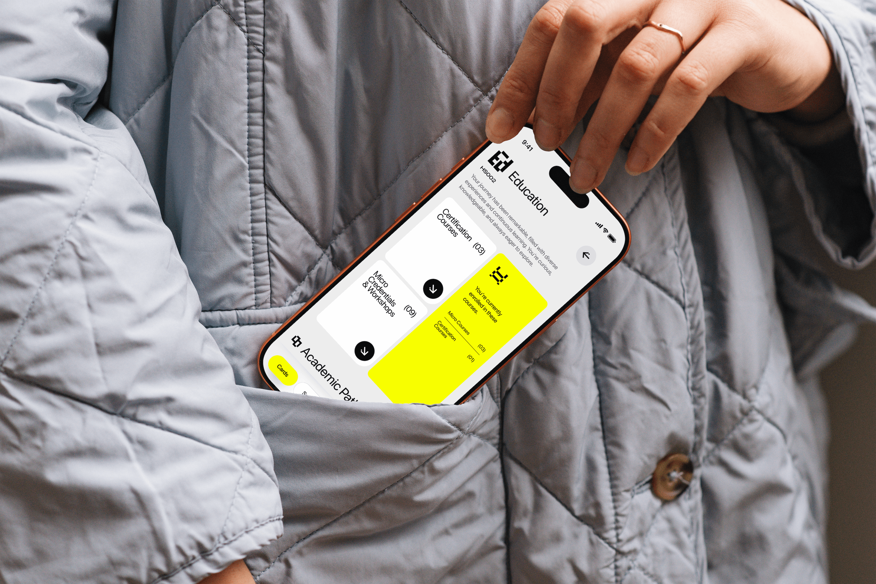
Human Status is an identity visualization platform (App) that converts personal data such as education, skills, personality traits, values, languages, and behaviors into a personalized icon system, enabling a person to be understood at a glance.
Generated by machines. Understood by machines.
Inspired by today's data-driven culture of ratings, scores, and algorithmic profiles, the project explores a future where identity becomes instantly readable through system-generated symbols rather than human interaction. At its core is an iconography system supported by a UI concept that demonstrates how such a platform could function. Human Status can be interpreted as either a tool for efficiency and accessibility or a critique of reducing human complexity into data.
Ultimately, it invites viewers to reflect on what is gained and what is lost when identity becomes a language designed by data, and whether the systems we are building today could gradually lead us toward a future where people are understood, evaluated, and defined primarily through data-generated identities. Ultimately, the interpretation is left to you.
LOGO CONSTRUCTION
A wordmark designed to feel familiar and direct. Built on a modular grid of precise ratios, the Logo mark draws on something familiar: two hands reaching across, two people meeting. The H was always more than a letter.


APP STORE CARD

APP ICON

TYPEFACE
SF Pro/Display
ABCDEFGHIGKLMNOPQRSTUVWXYZ
abcdefghijklmnopqrstuvwxyz
1234567890~!@#$%^&*()_+{}:"<>?/.,';][=-\`
a
a
a
a
a
a
Thin
Light
Regular
Medium
Bold
Black
Electric Green
HEX
#F8FF00
HSB
62 100 100
RGB
248 255 0
Used as the primary brand color across all visual communications, collateral materials, and digital platforms.
Charcoal Black
HEX
#0A0A0A
HSB
0 0 4
RGB
10 10 10
White
HEX
#FFFFFF
HSB
0 0 100
RGB
255 255 255


